Brief
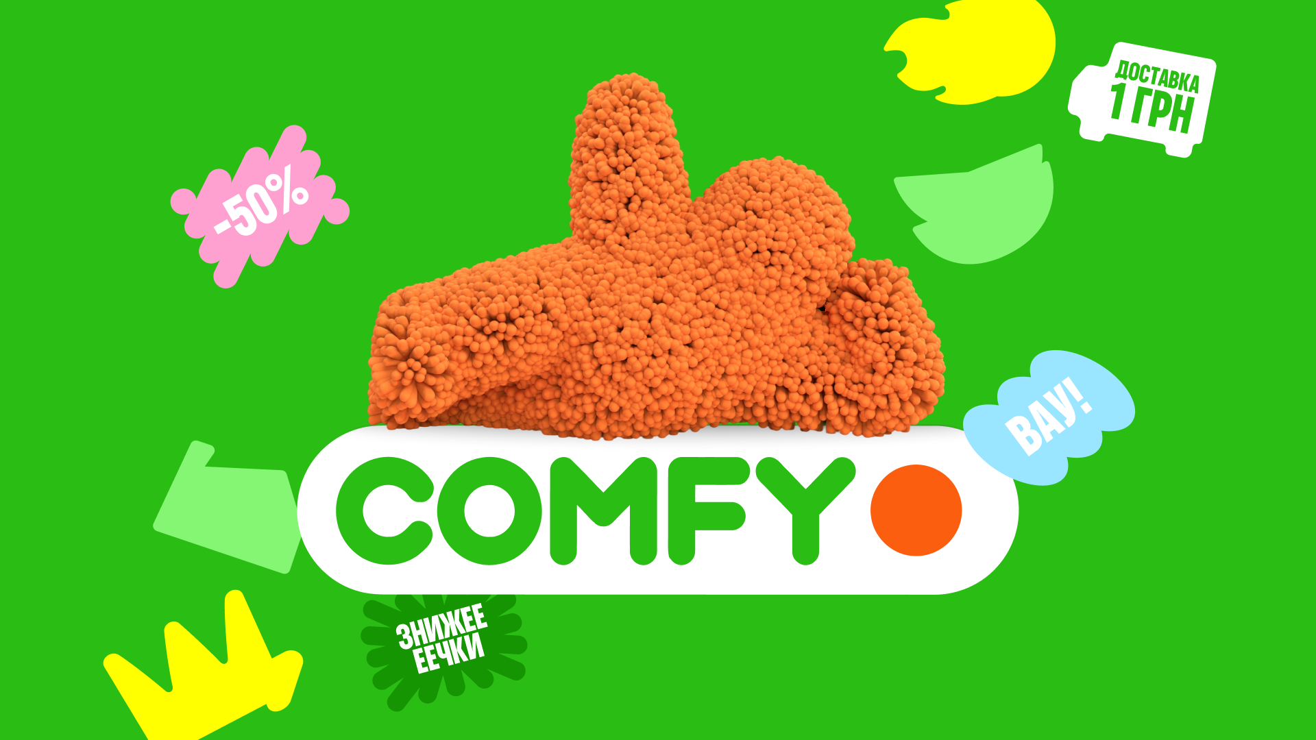
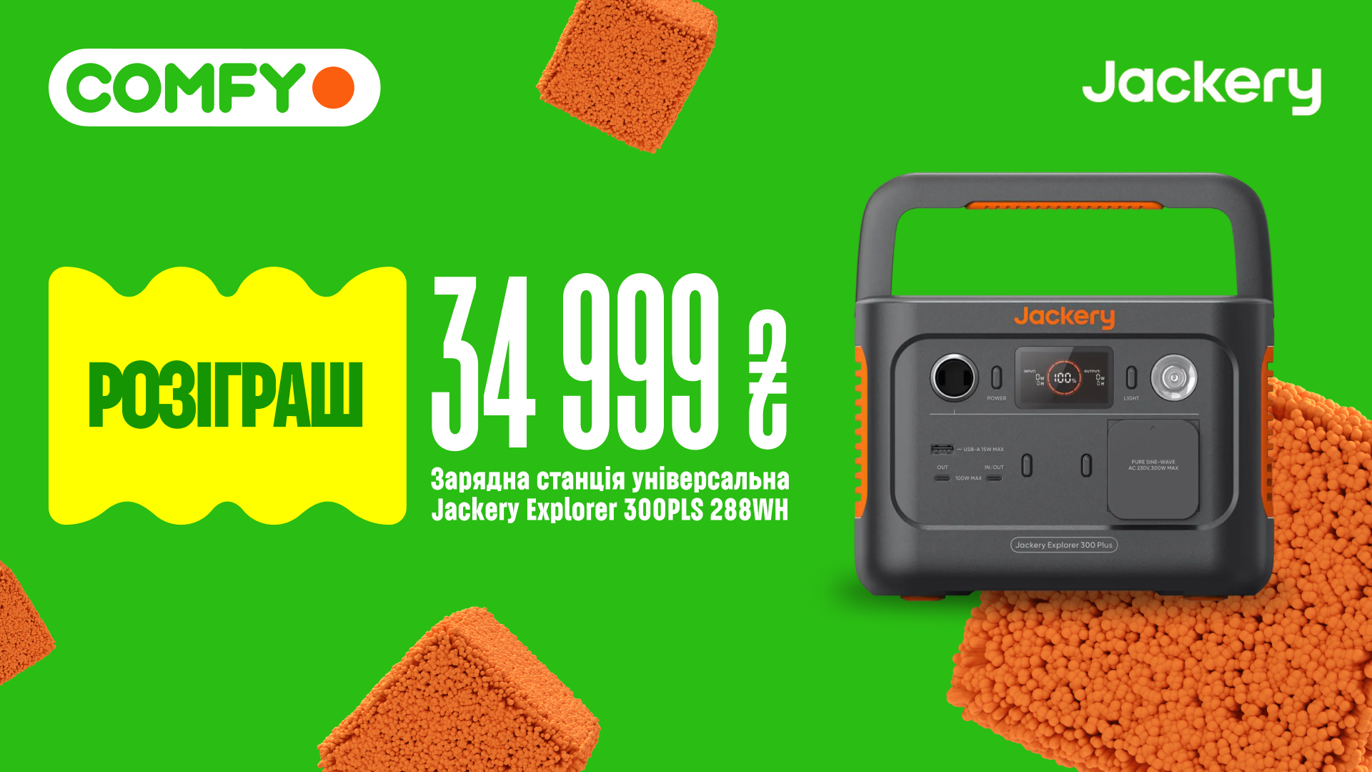
Comfy is one of Ukraine's largest tech retailers. The brand's existing identity was due for a refresh. Comfy's visual system had grown outdated — muted colors originally chosen with print production in mind, aging graphic elements, and a layout framework that was beginning to show its limits. This was especially evident in their Krashch product layouts — a mix of the Ukrainian words for "best" and "crush" — where the old system simply wasn't built to handle information-dense compositions, and the repetition had made the aesthetic feel formulaic.
Solution
The refresh touched every layer of the visual identity: we brightened and expanded the color palette for digital environments, established clear layout guidelines, refined the typography, updated the graphic elements and the mascot Push, and built an entirely new visual language for the Krashch format.
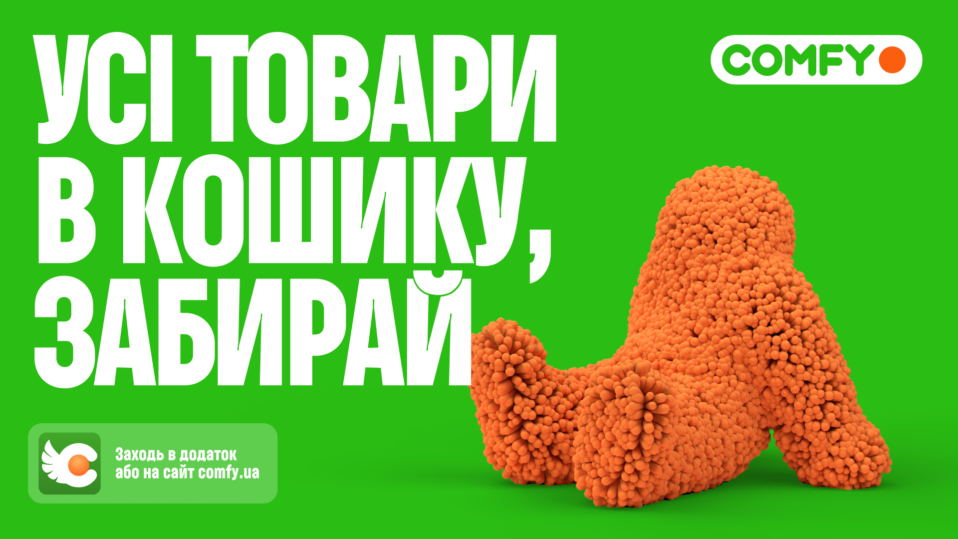
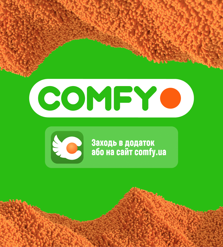
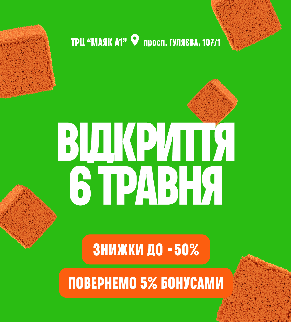


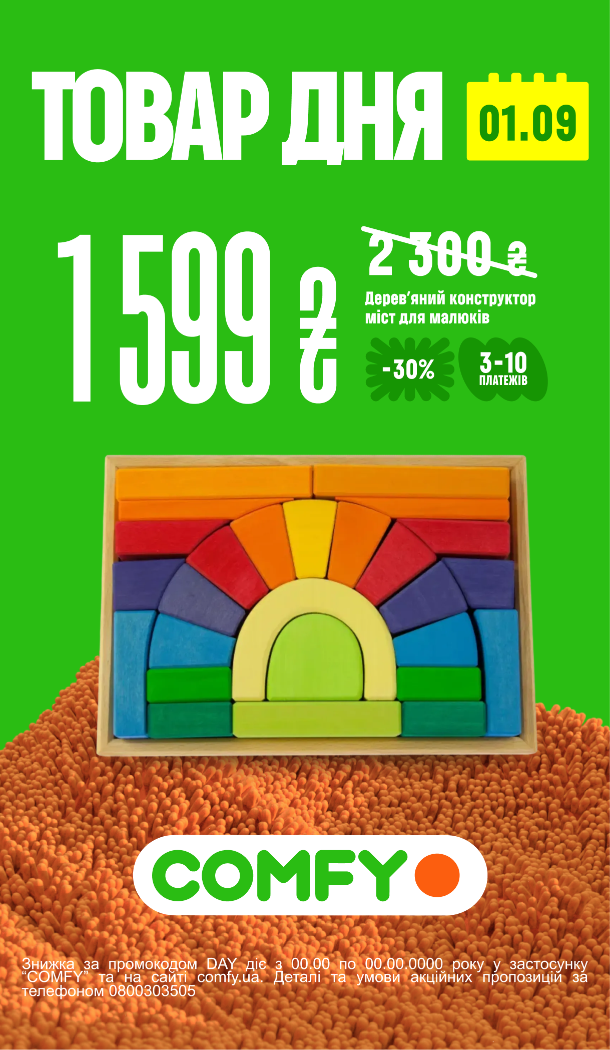
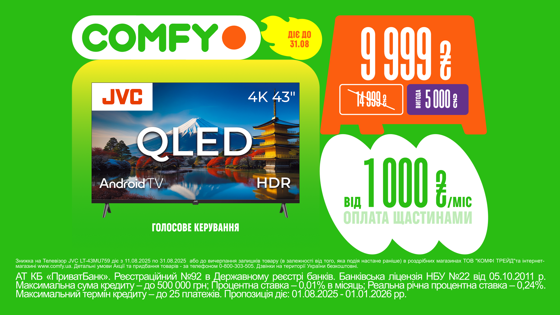
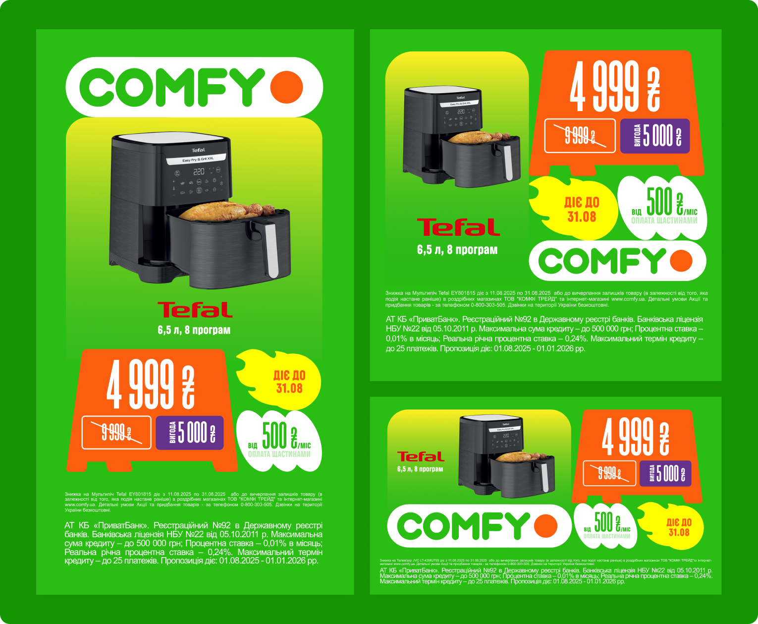
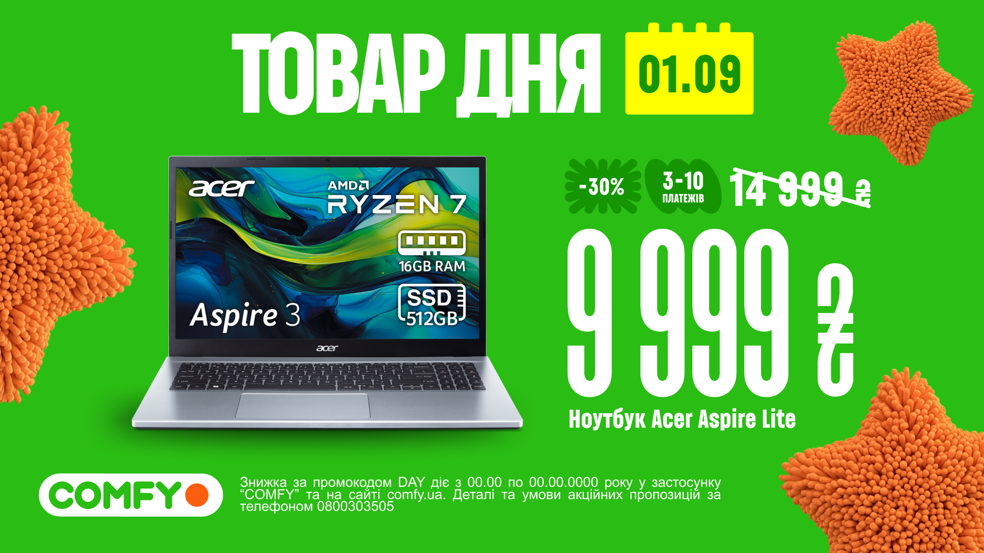
My involvement centered on concept exploration and developing the visual language for Krashch. We built a container system inspired by the feel of stickers — modular shapes that act as building blocks, so every layout is assembled like a construction kit where you can mix and match different forms, proportions, and colors.
My role: Graphic Design
Credits
- Banda Agency
- Creative Director: Maksym Boritko
- Creative Producer: Alisa Zelenska
- Visual Artists: Olha Severynova, Liza Popova, Maksym Volnov
